Journal · 4 min read
Shade Matching Porcelain Veneers: What the Shade Guide Misses
"Make me veneer number eight, A2" is not a shade prescription. Here is how Dr. Rhodri Thomas and I actually communicate color to the lab.
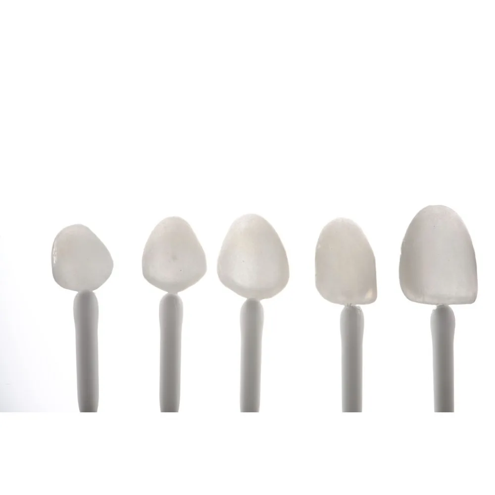
We are all guilty of this one.
"Please make me veneer number eight, A2. Thanks."
Do we think we are going to get a good result back? We are not. Shade is the part of the veneer workflow where dentists most often hand the decision to the lab and hope.
Teeth have more colors than your guide
Dr. Rhodri Thomas, who co-teaches Art of Ceramic with me, opens this lecture with a question: how many tooth colors are there?
People guess three, fifty, a hundred, infinite. The answer from the research he cites is 1,173 measurable shades in natural teeth, and covering them comfortably would take a guide with around ninety tabs.
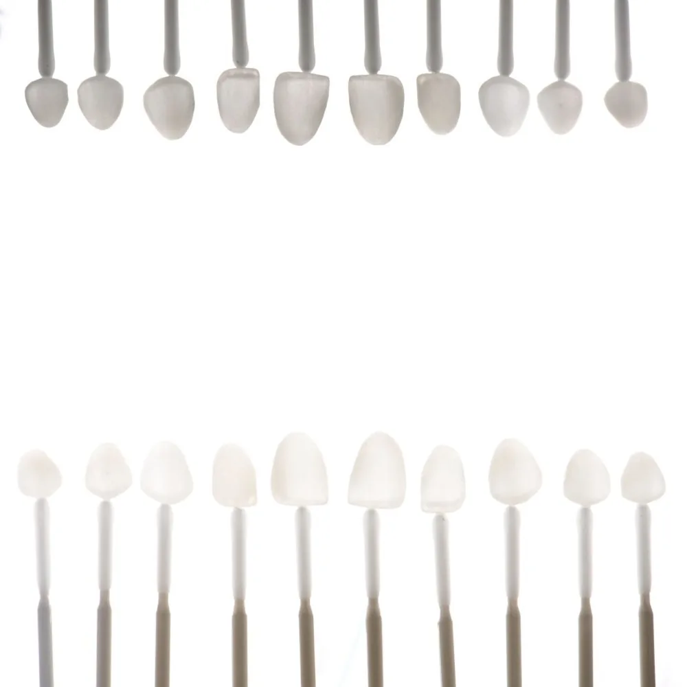
Meanwhile the shade guides most of us use were made in the 1950s for metal-ceramic crowns. As Rhodri puts it, we have landed on the moon and come back, and we are still using that.
The guide is still a tool. It is just not the whole answer.
Value and opacity matter most
Color has three parts: hue, chroma and value. Most dentists obsess over hue, the A, B, C or D.
In practice, value and opacity decide whether a veneer reads as natural. A veneer with the right hue and the wrong value looks like a tooth that does not belong.
The classic guide also does not handle age well. Older teeth become more translucent and more chromatic, which is part of why the 3D-Master style guides were developed. We still use a guide, because it is the common language, but we add far more information around it.
Translucency is a tool, not a goal
Everybody gets excited about translucency. I tell my course it is a tool.
If you have long teeth that we are trying to make look shorter, I can add more translucency. If you have short teeth that I want to look longer, they should have very little.
Lips matter too. A full or low lip line casts a shadow onto the teeth. On those patients I actually make the teeth a little whiter and denser, with less translucency, because translucency in that mouth reads gray.
That decision has nothing to do with the shade tab. It comes from looking at the face.
The two shade photos I always take
Beyond the standard photo series, I take two shade photographs for the lab:
- Retracted, slightly open, with three shade tabs held in the same plane as the teeth: my best match, one slightly brighter and one slightly darker.
- The same shot slightly underexposed, so the ceramist can read the translucency and the incisal detail.
Give the lab too much information, never too little.
Better tools when it matters
For single centrals, the hardest match in dentistry, Rhodri uses extra tools:
- Cross-polarized photography. It removes the specular reflection from the flash, so you see the color and the dentin structure without glare.
- Digital shade-analysis systems that read a cross-polarized image and give the ceramist a mixture to work from.
- Transilluminated photographs. Put the black contraster sideways under the incisal edges, place a flash under it pointing toward the back of the mouth, and fire. The light bounces back through the teeth and shows you where the opacity sits.
That last one solves a problem every dentist has had. The crown looks perfect at try-in, you cement it, the patient walks into daylight and it looks gray. That is usually an opacity choice, not a hue choice.
What not to do
Do not use softboxes for shade photographs. Diffusers make dentistry look soft and pretty, and they throw your shade off. Rhodri is blunt about it: you are not getting accurate shades with them.
Use your twin flash, or go cross-polarized. Do not guess under the operatory light.
Talk to the ceramist
The ceramist has never met your patient. They are working on a model.
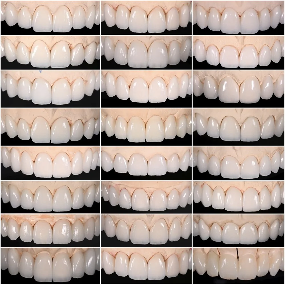
So send the photographs, the shade tabs in frame, the underexposed shot, the photos of the temporaries, and a note about what the patient wants. Bright and clean. Age appropriate. Natural to them.
And if the shade change is big, ask the ceramist how much space they need. For some, masking a dark preparation costs them room before they even start layering the pretty stuff on top.
Photograph the preps, too
Shade is not only about the teeth next door. It is also about what sits under the porcelain.
Preparations vary in color. A dark or uneven prep will show through a thin veneer, and the ceramist cannot fix what they cannot see. So photograph the preparations with shade tabs in frame, the same way you photograph the teeth.
Sometimes the answer is to mask with an opaque layer, which costs space. Sometimes it is to prep a little deeper where the dark area is. That is a decision you and the ceramist make together, before the final impression, not at the try-in.
The takeaway
- Prioritize value and opacity, then hue.
- Use translucency deliberately, based on tooth length and the lip line.
- Take the three-tab photo and an underexposed photo every time.
- Skip softboxes for shade.
- Ask the ceramist before the prep, not after the try-in.
Related reading: my dental photography settings and porcelain layering.
Questions, answered.
How do you shade match porcelain veneers?
Photograph the teeth retracted with three shade tabs in the same plane, your best match plus one lighter and one darker, then add a slightly underexposed photo for translucency. Send these with notes on value, opacity and the patient's goals.
Why do veneers look gray after cementation?
Often the opacity was wrong for that patient, not the hue. Transilluminated photographs and good communication with the ceramist about opacity help avoid it.
Should I use a softbox for dental shade photos?
No. Softboxes diffuse the light in a way that distorts shade. Use a twin flash or cross-polarized photography for shade.
Is the VITA shade guide enough for veneers?
It is a useful common language, but on its own it misses value, opacity and translucency. Combine it with calibrated photographs and direct conversation with your ceramist.